matplotlibを使ってグラフを作成しよう
今回からmatplotlibについて説明していきます。
matplotlibはPythonの標準的なグラフ描画ライブラリーで、様々な種類のグラフを作成することができます。
作成できる主なグラフとしては、折れ線グラフ、ヒストグラム、散布図、3Dグラフなどがあります。
matplotlibをインストールする
まず、matplotlibを使うために、pipコマンドでインストールします。
pip install matplotlib
matplotlibをインポートする
matplotlibをインポートします。
matplotlibのインポートは、以下のような書き方が一般的です。
import matplotlib.pyplot as plt
または
from matplotlib import pyplot
グラフをプロットする
プロット(plot)とは、座標にいくつかの点を打ち、それを結ぶことによって作られる線や図形のことをいいます。
matplotlibでは、plot()関数を使ってプロットします。
X座標を省略した場合は、X座標の目盛りは「0, 1, 2, …」と表示されます。
plt.plot([X座標], Y座標, [フォーマット], [キーワード])
メモ
「plt」は、「import matplotlib.pyplot as plt」としてインポートした場合です。
フォーマットの書き方
フォーマットは、'[marker][line][color]' の並びで表現します。
例えば、markerを「point marker」、lineを「solid line style」、colorを「red」にする場合は、「'.-r'」と書きます。
また、すべての項目を指定する必要はなく、例えば色を赤にしたいだけであれば「'r'」と書きます。
使えるキャラクターは、以下の通りです。
- Marker
| キャラクター | 内容 |
| '.' | point marker |
| ',' | pixel marker |
| 'o' | circle marker |
| 'v' | triangle_down marker |
| '^' | triangle_up marker |
| '<' | triangle_left marker |
| '>' | triangle_right marker |
| '1' | tri_down marker |
| '2' | tri_up marker |
| '3' | tri_left marker |
| '4' | tri_right marker |
| 's' | square marker |
| 'p' | pentagon marker |
| '*' | star marker |
| 'h' | hexagon1 marker |
| 'H' | hexagon2 marker |
| '+' | plus marker |
| 'x' | x marker |
| 'D' | diamond marker |
| 'd' | thin_diamond marker |
| '|' | vline marker |
| '_' | hline marker |
- Line
| キャラクター | 内容 |
| '-' | solid line style |
| '--' | dashed line style |
| '-.' | dash-dot line style |
| ':' | dotted line style |
- Color
| キャラクター | 内容 |
| 'b' | blue |
| 'g' | green |
| 'r' | red |
| 'c' | cyan |
| 'm' | magenta |
| 'y' | yellow |
| 'k' | black |
| 'w' | white |
キーワードの書き方
キーワードは、ラベル、線の幅、マーカーの色などのプロパティを指定するために使われます。
キーワードの書き方は、「キーワード=値」のようにします。(例:「color='red'」「markersize=5」)
以下はキーワードの一部です。
| キーワード | 内容 |
| color or c | 線の色。フォーマットでは使えない色も指定できる。色名または16進数で指定 例:color='pink'、c='#ffc0cb' |
| label | 凡例に表示されるラベル |
| linewidth or lw | 線の幅 |
| markeredgecolor or mec | マーカーの枠の色 |
| markeredgewidth or mew | マーカーの枠の幅 |
| markerfacecolor or mfc | マーカーの色 |
| markersize or ms | マーカーのサイズ |
キーワードは他にも多くの種類があります。
詳しくは、以下の公式サイトを参照してください。
グラフを表示する
プロットしたグラフを表示するには、show()関数を使います。
plt.show()
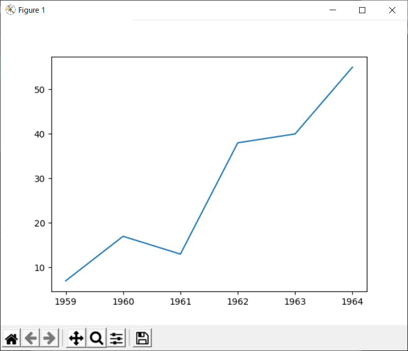
グラフを表示するプログラム
matplotlibを使って簡単なグラフを表示するプログラムは、以下のようになります。
|
1 2 3 4 5 6 7 8 9 10 11 12 13 14 |
### インポート import matplotlib.pyplot as plt ### X軸 x = ["1959", "1960", "1961", "1962", "1963", "1964"] ### Y軸 y = [7, 17, 13, 38, 40, 55] ### プロット設定 plt.plot(x, y) ### グラフ表示 plt.show() |
プログラムを実行すると、以下のようなグラフが表示されます。
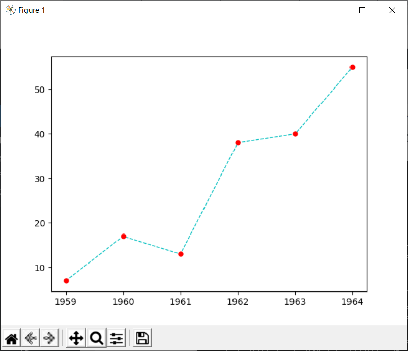
次にフォーマットやオプションを使ったプログラムを作ってみましょう。
11行目のplot()関数を以下のように変更します。
|
1 |
plt.plot(x, y, 'o--c', linewidth=1, mfc='red', mec='red', ms=5) |
上記のようにプロットを変更したプログラムを実行すると、以下のように表示されます。